Category: innovation

  • Understanding the impact of climate change on remote agricultural communities to design for resilience

    Understanding the impact of climate change on remote agricultural communities to design for resilience

    *Disclaimer: This article was published originally on the Medium blog of the Airbel Impact Lab of the International Rescue Committee (IRC) on 30/09/2021

    Insights from online workshops with IRC teams in Syria, Pakistan, Niger and South Sudan

    How does a prolonged drought affect a farmer in a remote province in Pakistan, versus another in conflict-stricken Syria? What about the subsistence farmer in South Sudan or Niger, who has saved seeds for the next season, but ends up consuming those in times of need?

    Remote rural farming communities are most vulnerable to extreme climatic events, such as prolonged droughts, pest and disease outbreaks, heavy recurrent rainfall and flooding. Farmers living in areas of conflict and insecurity are particularly affected. When displaced they lose access to fertile land, livestock, equipment and other assets essential for their survival.

    How can we work with rural farming communities to build resilience to the devastating effects of climate change?

    At the Airbel Impact Lab, we aim to work with communities to design solutions for the long-term. Emergency relief after a climate disaster brings critical short-term support. But in the long-term it is necessary to create agricultural systems that can be sustainable and resilient. Before we even start thinking about such solutions we need to better understand the complexity of this problem. To start, we decided to focus on one critical element of climate resilience: seed security. In other words: the farmers’ ability to access the seeds best suited to their environment for planting.

    Analyzing complex problems in remote workshops

    Seed security and climate change challenges cannot be addressed with a single solution, because they are systemic and complex. To understand the current state of agricultural systems in remote farming communities, IRC conducted seed security assessments in South Sudan, Niger, Pakistan and Syria. This revealed a combination of interconnected factors that contribute to the devastating impact of climate change. For example, the increased need for awareness and education in efficient land and water management, in order to cope with erratic weather patterns. The fact that traditional post-harvest processing practices and storage tools are no longer sufficient to protect crops from pests and diseases, resulting in huge losses for farmers. Financial instability on the other hand is limiting the farmers’ capacity to invest in agricultural improvements.

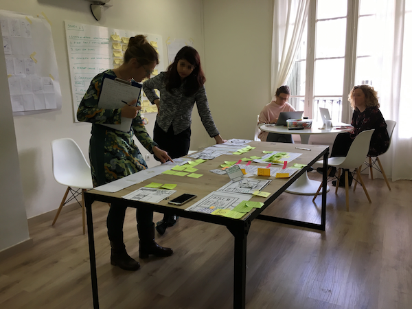
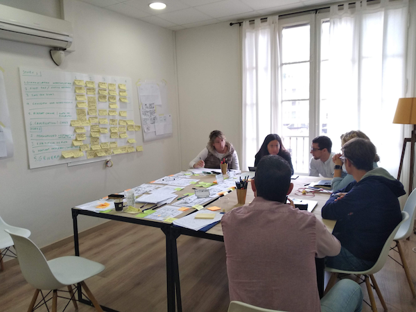
    This was just a starting point. To better understand the context of each particular country and the scale of these issues, we organized and led four online design workshops with the respective country teams focusing on seed security. Based on the results of the seed security assessment and desk research, we prepared a set of problem statements following the same structure: context, who, what & impact.
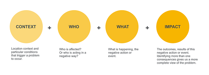
    Here is an example of a problem statement we used:

    Context: In Pakistan, in small farming communities…

    Who: Women who work in the farms…

    What: Do not participate in purchase decisions that affect their work and have no access to other markets …

    Impact:

    …they have limited access to improved seed varieties & agricultural technologies

    …they don’t have access to information and knowledge to combat climate change

    …they are reliant on growing and selling seed varieties that are preferred by other female farmers
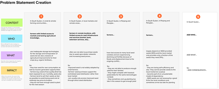
    Example of problem statements for South Sudan, with emphasis on Pariang and Panyijiar Counties

    We then discussed each problem statement in depth with the IRC teams in each country, in order to draw out contextual details and insights.
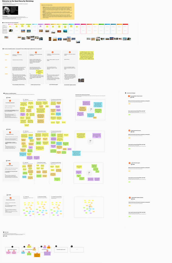
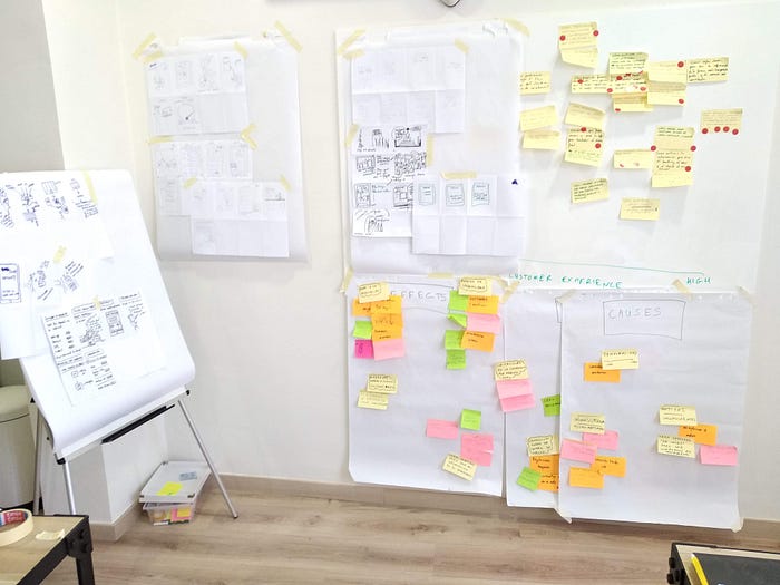
    Screenshot from our collaborative Mural with the Pakistan IRC team

    The problem of seed security

    Although all four countries share similar challenges in achieving seed security, the local context highlights some notable differences. In Syria, the war has disrupted the entire seed value chain for commercial farming: agricultural infrastructure, supply and distribution chains have been heavily impacted across the country. The government no longer provides agricultural extension services, financial support, or loans to farmers. Research and seed multiplication centers are not functional. As a consequence, the seeds that farmers have access to have degenerated overtime. Seeds have lost their quality and productivity, resulting in loss of income for the farmers. To make matters worse, many farmers do not have access to sustainable irrigation systems and extended droughts threaten their livelihood. In the last season, 90% of wheat and barley farmers lost their main source of livelihood due to drought. The self-administration government in North East Syria provides some support to local farmers, but it lacks sufficient resources and expertise in agriculture.

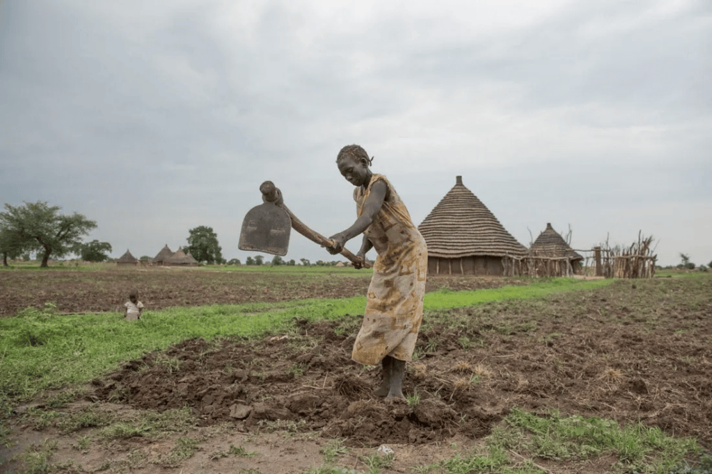
    In Niger and South Sudan, most people engaged in agriculture are subsistence farmers. Their livelihood relies on the seeds they save for the next season or buy from the local markets. When times are tough, farmers consume the seeds they had saved for the next season. And when a climate disaster ruins their entire crop, they rely on NGO support.

    In South Sudan, there is an increasing dependency on NGO-supplied seeds — farmers get 50% of their seeds from NGOs and buy only 11% from the local market. NGO-provided seeds are “emergency aid” solutions, imported from other countries and are not very well adapted to local climatic conditions. It is quite often the case that the seed aid arrives too late for the planting season and then farmers lose their yield to flooding. The Unity State in South Sudan is particularly affected: in 2020 alone, more than 5,750 farmers in Panyijair lost all their seasonal crops to floods.

    In Niger, the local markets do not provide a sufficient supply of good quality seeds, often due to the high amount of post-harvest losses, especially for legumes, such as cowpea. Traditional farming communities still use inefficient storage methods, so seeds are more susceptible to disease and pests. Farmers in remote areas typically have less awareness and access to improved storage solutions, like the triple bagging technique using PICs bags, a solution that is both safe and affordable.

    In Pakistan, 70–80% of farmers are small-holder farmers, who rely on traditional farming practices and tools passed down through generations. Improved seeds that are more resilient to droughts are unaffordable for many of them. 95% of farmers throughout Pakistan also do not do a germination test. Even those who have access to good quality seeds, often suffer losses because of inefficient post-harvest processing and storage. Farmers rely on word of mouth for information and are often not aware of alternative techniques and innovations that can help them adapt to the changing climatic conditions. Most vulnerable of all are the ‘sharecroppers’, or farmers who rent their land, because they do not have any decision making power on the crop varieties or techniques to use. When there is a major climate disaster, like a prolonged drought or intense recurrent flooding, only landowners are eligible to receive subsidies from the government, leaving sharecroppers with no support.
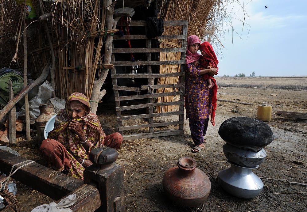
    Farmer family living in makeshift structure in Sindh, Pakistan: their farmland was destroyed by flooding

    Limited awareness and access are two sides of the same coin

    It became clear that we cannot help farmers build resilience to climate change by focusing on only one aspect of a complex problem. Increasing awareness around potential new solutions is intertwined with increasing access to those, which often means strengthening farmers’ financial capacity. As our IRC team in Pakistan clearly identified, timely access to information can only be effective if farmers are willing to take risks to try new seed varieties and invest in agricultural improvements.

    In South Sudan, the lack of access to improved seeds, tools and know-how is an even more difficult problem to tackle, as farmers face a plethora of diverse barriers. The lack of roads and basic infrastructure means they can’t travel to nearby communities and markets. Isolation also limits their awareness and access to agricultural training and demonstrations. Without financial support, farmers are not able to invest in good quality seeds — even in the rare occasion that these become available to them. Conflict and insecurity displace many farmers in South Sudan. Those who have lost their productive land, assets and markets are forced to move into marginal areas, like floodplains.

    In Syria, the lack of access to good quality seeds is also interlinked to limited financial capacity. Farmers and agro dealers are both affected by inflation, unstable exchange rates and the absence of government support. All this is painting a very volatile financial picture — which means that traditional money lending practices are no longer viable. Farmers resort to borrowing cash from relatives and friends, to the extent that this is possible.
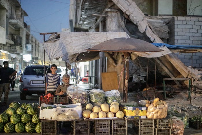
    A Syrian father and son selling vegetables at the market of Saraqib, in the East of Idlib Governorate

    On a positive note, the practice of ‘warrantage’ in Niger (the equivalent of WRS= Warehouse Receipts System) enables some seed producers to save seed in order to sell later at a more favourable price. However, this practice is not very developed in the Diffa region, where vulnerable refugees and displaced farmers are located. In some areas, producers’ cooperatives have emerged, who tend to buy seed supplies in groups to share. This practice enables farmers with limited economic means to buy the small quantities that they can afford.

    For long-term sustainability, the need to raise awareness around more resilient, better quality seed varieties goes hand in hand with the need to increase farmers’ financial capacity to buy them. To better understand how to design a system that supports this, we need to do a deep dive into past community-based initiatives, such as seed banks, in each country’s context and to learn from their successes and failures.
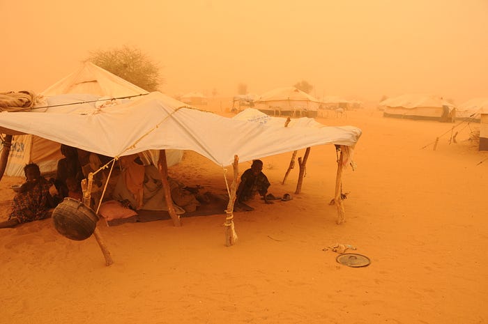
    People who have fled violence and food shortages in Mali at Abala Camp, Niger

    Creating opportunities for female farmers

    In both Syria and Pakistan, while women farmers have very limited decision making and purchase power, they are active farmers. Female farmers mostly engage in manual labor (e.g. planting & harvesting) in small cultivations and gardens. It is not socially acceptable for women to operate machinery. Neither to engage in sales activities in the local market. This excludes women from gaining agricultural know-how and limits their climate change resilience. However, there are opportunities, at least at a small scale. For example, women do attend NGO-run field farmer schools. A recent IRC Agricultural Livelihoods program in Syria had more than 70% female participants. They successfully acquired new knowledge and skills in a range of diverse areas, such as modern irrigation methods, winter crop and mushroom cultivation and beekeeping.

    The government of Pakistan recently approved a legislation for inheritance transfer which will enable women to own land. This might still not eliminate cultural barriers for women — since even those who currently own land do not practice farming themselves. But we believe that there is an opportunity to elevate women’s role in farming, for example, by training female farmers in seed germination tests and seed multiplication activities that are culturally acceptable.

    South Sudan paints a different picture, with female farmers forming 67% of the local farmer population. Most vulnerable farmers are those who have lost their land because of conflict and insecurity and due to intense recurring flooding. Women and refugees are the groups that are most heavily impacted by climate change disasters. We need to understand how to better involve them in activities that can help develop their skills, climate change resilience, and decision making power.
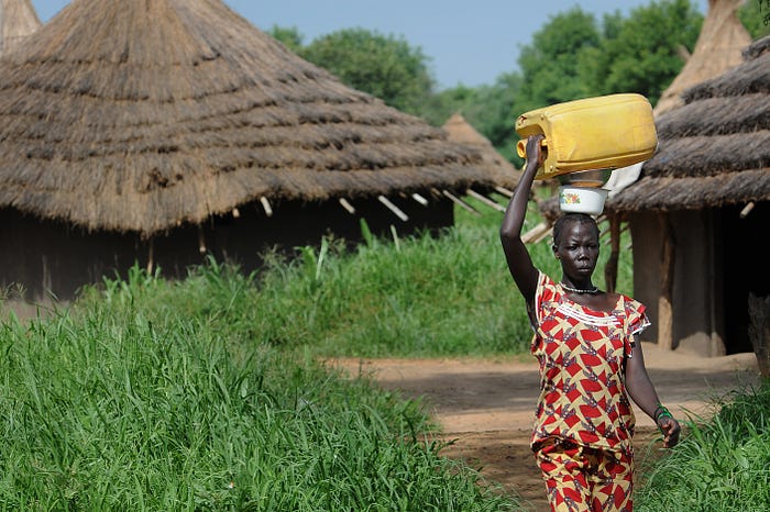
    A woman going to collect water in a village near Torit, South Sudan

    What next?

    The workshops gave us a good overview of the challenges farmers face in each country.

    In our heads, we are already starting to formulate a range of interesting “How might we…” questions that could lead to a breadth of promising design ideas. How might we engage women farmers in starting and running a self-administered seed multiplication business in their community? How might we combine the ‘warrantage’ practice and PICS storage bags with the seed system, so that seed producers can secure income and are able to pay for affordable improved storage?

    But wait… before we kick start a design process, we first need to understand the needs and barriers from the farmers’, seed producers and agro-dealers perspective. A key question that we need to answer is what needs to be in place for a community initiative to be self-sufficient and sustainable as a local business in the long term, without the support of the IRC or any NGOs. Our next step is to reach out to small-holder farmers — with the support of our country teams — to run a field study to be able to design the right solution for the right context.

    Acknowledgements:

    We would like to thank the IRC country teams and Technical Advisors in Syria, Niger, Pakistan and South Sudan for their valuable inputs and support in this project.

    For comments, please visit the original blog post: https://medium.com/airbel/understanding-the-impact-of-climate-change-on-remote-agricultural-communities-to-design-for-eb122e43177f
  • Escape the trap of user tests: focus on the service value

    Escape the trap of user tests: focus on the service value

    This article suggests rethinking what we learn when we put concepts and prototypes in front of customers for feedback.

    What does ‘user testing’ mean to you? The most common flavour is ‘usability testing’ — which actually makes more sense as a term because it does not sound like we are testing the ‘user’. We put products and services in front of target customers to find out if they are easy and delightful to use. Right…?

    So why is ‘user testing’ a trap then?

    To answer this question, we need to take a step back and reflect upon why and how we evaluate services. Let’s say, company Y wants to launch a new service. They create some sorts of prototype to visualise parts of this service and get customer feedback. They might first test a paper-based prototype or (more often) an interactive mock-up of a mobile/web app. Some would go straight into developing an MVP— based on the assumption that they need real data to get real insights.

    The next step is to invite people, give them the prototype and ask them to do a specific task or just explore the service, while thinking out loud. Then ask for feedback on the overall experience, probing on particular parts that should be improved and what the potential customer thinks of the service as a whole.

    Our questions define the kind of insights we gather in this process. Are we asking the right questions?

    Guerilla-style research for a new service concept with a fake mock-up

    As a design researcher, I have noted over the years that — regardless of the type of prototype we test— we can gather insights on 3 very distinct levels:

    1. The design. Comments on the interaction, the overall flow, colours, visual hierarchy, confusion with labels, copy etc — these are very common examples of feedback on design. People reflect upon how the prototype has been put together and compare it with their previous experiences with other services. They state what they like and what they don’t and why. This type of feedback can easily mislead us to we lose sight of what’s important. The fact that they like the design doesn’t necessarily mean that this is the right service for them.
    2. The idea, the concept. How many times have I heard: “This is great! Amazing idea! I love it…”. This is the biggest trap of all and I have seen product managers fall for it, too many times. A very positive response to an idea does not necessarily imply that the customer would use the service — even if they actually state they would! Why? Because people like to be part of a cool idea. They immediately think of friends or people they know — who this great service would be for — instead of their own needs. A cool concept is not necessarily a meaningful and useful one. Another issue here is that people also try to please us. We asked for their opinion, their natural intention is to make us happy and many believe that they should encourage us by giving positive feedback (unless we explicitly ask for criticism). If you want to understand better this effect, read the Mom Test.
    3. The perceived value. This is the hardest nut to crack. People give us insights on whether they see benefits for them or not, but more often we need to probe them to get their real view on the service. This is the moment when I put aside the prototype and ask the person for specific examples: how could this service support them in their lives, in which ‘moments’ would it make sense to have it and what would they expect the service to do for them. We need to be open to alternative scenarios and service ideas. We are likely going to encounter constraining factors that nobody has considered yet. But these are our key strategic insights, the ones that will determine the success or failure of the service.

    The problem is that ‘user testing’ — run in the traditional way — puts most emphasis on design rather than value.

    This is why it is a trap, because many companies evaluate the design of a product — instead of their value proposition. Is this service addressing a real need or solving a significant enough problem? Is there a fit between what the customer needs and what the service is offering?

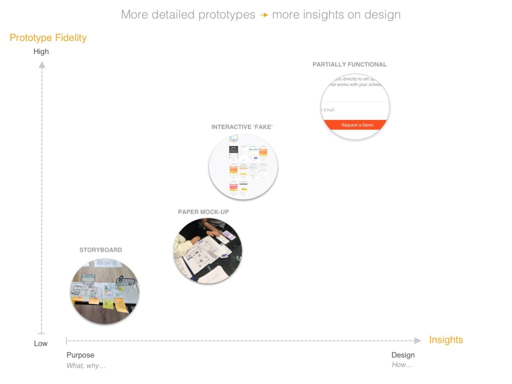
    The more detailed and refined is the prototype that we are testing, the more the customer feedback naturally tends to be focused more on the design and the concept, rather the value of the service.

    The insights that naturally emerge depend on the level of fidelity of the prototype

    Diagram: the insights that naturally emerge depend on the level of fidelity of the prototype

    The real question one must ask is: what am I actually trying to validate by putting this prototype in front of potential customers?

    You can get insights with all these different types of prototypes — but you do need a skilled researcher who is able to shift focus towards the important questions of ‘what & why’ rather than ‘how’. A professional who is also able to look underneath people’s fascination with a new idea to find out if it could truly could serve their needs.

    On the other hand, we often do need to visualise the full detail of the service to get a complete picture. I was recently testing a new concept that would be driven by data and behavioural patterns. This would have been quite difficult to explain to people without detailed examples. Participants really needed them to understand what the information means and how it could help their decision making. Then they were able to tell me whether this service was relevant to them or not and why.

    Prototypes don’t have to be interactive though. Depending on your research questions, simple paper mock ups can go a long way to have a meaningful conversation about service benefits. They are also much more cost effective and fast to produce.

    Testing a concept with paper mock-ups (UI)

    I believe we need a new definition for ‘user testing’ one in which we focus our efforts on evaluating value, rather than design.

    It is time to break free from the traditional user testing approach: to pause the ‘test’ and instead explain to people the elements they they might be missing or not understanding so well. It is best to ‘walk someone through’ a prototype in order to get their reaction to the benefits of the service, rather than to test if they can figure out how to use it.

    We are talking about a ‘concept test’ rather than usability testing. Concept testing, however, has been associated traditionally with market research and methods like surveys and focus groups. The ‘prototypes’ used for concept tests in market research are typically landing pages, flyers, promotional materials. Even SurveyMonkey seems to associate ‘concept tests’ with testing logos and corporate identity. I question whether these techniques really help us understand customer needs or how to solve their painpoints. I see them more as way to validate whether the marketing material resonates well and whether the service is sellable. There is a big gap between market research and human centred design research.

    The Lean Start-up movement has addressed this gap in two ways: a) talking to customers about their problems and b) developing an MVP. A great approach, though many start-ups and entrepreneurs struggle to define what this MVP really should be, what are the core features versus nice to haves and where to draw the line. Others have trouble getting the right insights when talking to their customers, because they tend to follow a sales strategy, rather than a research approach. Listening should come before selling.

    This is where human-centred design research plays a big part. We apply a mix of storytelling techniques to get early and honest feedback.

    One of my student groups (MA Design Management) is creating a physical storyboard for a service concept

    (Picture: One of my student groups, from the MA in Design Management, is creating a physical storyboard for a service concept)

    For example, for new, early stage services the use of storyboards in one-to-one interviews with potential customers can be quite a powerful tool. Storyboards provide context (where am I, what am I doing, what is my challenge), something that is missing when we put user interfaces in front of people to test.

    Storyboards can help us validate the physical & human aspects of a service

    Another advantage is being able to gather insights for services that rely a lot on human and physical touchpoints — not just digital. What about a ticket office? Or customer support? We do need to be able to capture the perceived value and customer expectations for those touchpoints as well.

    In conclusion…

    Before giving prototypes to potential customers to evaluate, you need to be crystal clear about the question that are you trying to answer:

    1. Do they have a need or a problem I can solve with my service? (problem validation)
    2. Does my service satisfy their needs, do they see value? (service & need fit)
    3. Do they understand how my service works and how to use it? (design & usability)

    Based on this choice, you need to prepare the right set of questions and define the appropriate level of fidelity for your service prototype. Value-focused questions are more important than design-focused ones. There is no point in creating a design that people love, for a service that they don’t really need.

    Thanks for reading! Please share your thoughts on this topic in this survey (only 3 questions): How might we design ‘user tests’ that focus more on the value of a service?

    (This article was first published on Medium on 21/06/2019)

  • Hacking the Design Sprint method to solve a complex problem

    Hacking the Design Sprint method to solve a complex problem

    What we learned by adapting the 5-day Design Sprint approach to address a big challenge: flight delays

    (This article was first published on Medium on 22/01/2019)

    Design Sprints have become a great tool for product development for many — but can you actually apply the same methodology to solve a complex and multifaceted problem? Say, a problem like flight delays?

    Creative and storytelling workspace

    So the first questions are…how does one approach a problem like this? Do you try to analyze operational processes and see where the failures are, try to attack the root cause? Do you assume that most flight delays cannot be avoided, but are damaging to the airline’s brand and therefore you focus on how to minimize the negative impact on customers?

    How can you create a process that enables the airline to analyze and solve their points of failure in 5 days?

    Is a Design Sprint even the right methodology for a problem of this nature?
    We know it is a good recipe for cross-functional teams in product development with many success stories. But we also know it has received a lot of hype and that not every design problem is a product design problem.

    These are some of the questions I asked myself, when I happily accepted to lead this project. As a design researcher and facilitator, I realised that the Design Sprint methodology, well documented by Google, would need some serious hacking to make this work.

    So these are our “hacks”:

    • Split the Sprint Team of eight into two Teams for all collaborative exercises
    • Share innovative ideas and inspiration from other industries
    • Plan two validation sessions with potential customers instead of one. This enables you to shorten the lead time to 2,5 days and run 2 cycles in 5 days
    • Do not do any usability testing or cognitive walkthroughs. Do concept tests to validate the value for customers instead, a different research method
    • Invest time to analyse the results of the 1st session in-depth with all the Sprint team
    • Focus the creative work on storytelling rather than the development of one single solution or prototype
    • Enable solution co-creation with the participating customers

    And here is what we learned through the process.

    First step: find the stakeholders representing the different problem facets
    We put ourselves in the shoes of our client: who can help us understand the causes and effects of flight delays? E.g. professionals from operations, customer experience and even beyond the company— airport managers responsible for handling disruptions. We needed to understand the ‘whys’, but also what had already been trialed and failed. We needed to tap into insider knowledge of delay patterns.

    If this was a research project spanning over a few months, which stakeholders would I interview?

    Collaborative prototyping

    You must break organisational silos to bring functions together.
    We asked for a list of roles, not really knowing who will be on the team until the last minute. Getting senior managers to commit 5 days of their time is an unthinkable challenge in a big organisation, in which our client excelled.

    We booked a nice apartment — far away from the office — and made big promises to make this happen. But it all paid off. Yes, people complained about the 5 days. And they had to take the occasional call or skip parts of user testing to attend a meeting. However, everyone engaged until the end. Why:

    The knowledge exchange is tremendous: people discover so much about how things work in their own company. This changes their perspective forever.

    Getting instant responses to “what if…” questions. Being able to compare tools and processes. To share best practice, as well as failures.

    Once we established a common understanding of the problem and a common objective, we needed to shift from analysing a problem to creating solutions. For this, we showed them inspirational ideas and innovations from other industries. Sometimes, you just need to look somewhere else to exit a loop in your thinking process.

    And here is another barrier: how do we facilitate non-designers to visualise their ideas on paper?

    There is no need to worry about drawing skills — you can use props.
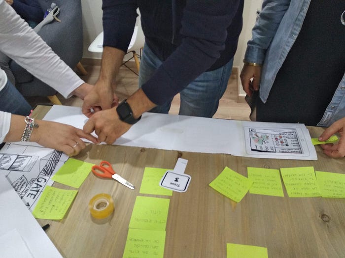
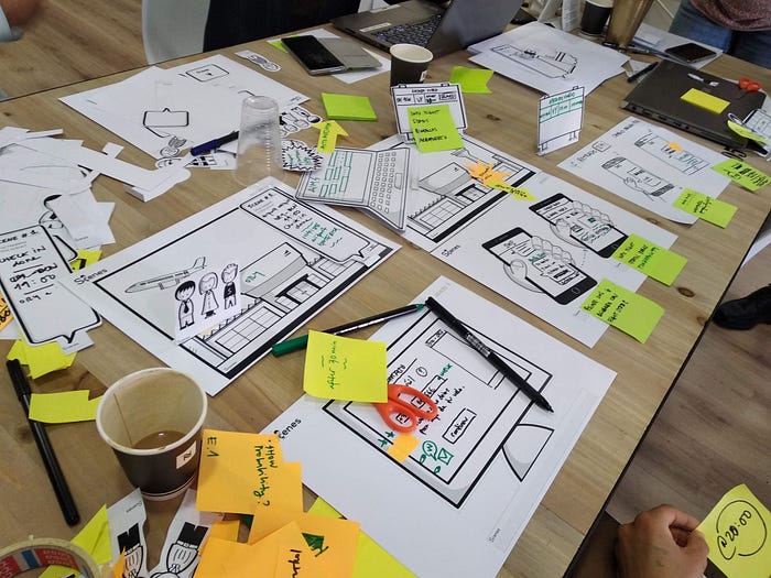
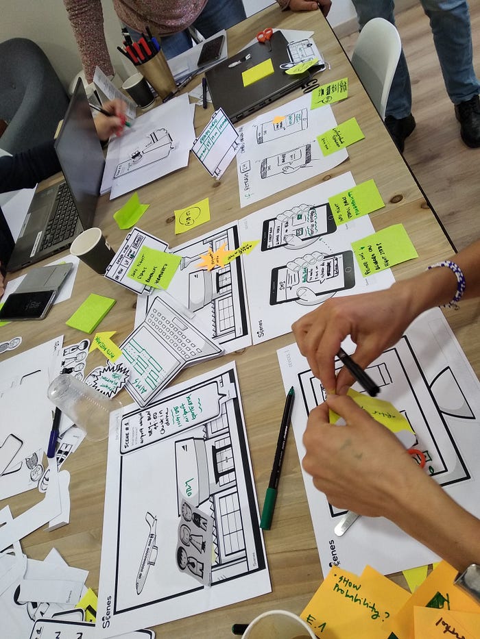
    We did ask participants to sketch 8 ideas in 8 minutes (the Crazy 8s) and it worked really well to our surprise. Because this was not about drawing the perfect solution, but about lifting the spirits, being creative and having fun. The team was then ready to start storyboarding delay scenarios and brainstorm on solution ideas. We used the Scenes™toolkit for that — a great storyboarding tool developed by SAP. Rather than drawing stick people, you can write on existing props and just focus on your story.

    When both teams had a story to tell, we focused on the value of their solutions for the end customer. We challenged them to think in an experimental way.

    What are your ‘burning’ questions? What do you want to find out when you share your solution ideas with customers?

    Concept testing session with storyboards

    Concept testing is not a usability test. The fundamental difference is the focus on ‘value’. Does this solution alleviate pain during a flight delay? Does it help people feel more in control? Or, to put it simply, is it good enough?

    Storytelling helps provide enough context to be able to have a meaningful conversation around value and customer benefits.

    The reason we planned two user research sessions instead of one was to give us enough time to experiment and fail. When working with high level service concepts through storytelling, more time is needed to find the right direction. User interfaces can be drawn and fine-tuned after the Sprint, but what if the solution is useless?

    The Sprint Teams found the first validation session with customers quite a revelation. Many assumptions were challenged, but also new opportunities opened up, as participants empathised with the characters in the stories and engaged with the creative process.

    Do a research analysis and insights summary with the entire team. Not everyone was present in the user research, but the whole team learned from the detailed analysis session. Those who were assigned as notetakers shared their insights from each session and we were able to draw some conclusions on the proposed solutions. As expected, the teams needed to go back to the drawing board.

    Do not give up in tough moments of truth. There is always a different story you can tell the next time .This was difficult, on Thursday afternoon trying to re-work ideas or come up with alternative ones after an already intense week. But it was probably the most important session in the Sprint. Some people realised that they had constrained their ideas because of known organisational barriers and had suggested small improvements, with low impact. Now they had to try again. Others realised that their concepts were still too high level, they needed to find more concrete examples to make them relevant and useful.

    Stories with solution concepts being prepared for the ‘testing’ table

    Make customers part of the creative process. The second validation run with customers was a success. Actionable, detailed feedback made it easy to prioritise solutions. Positive reactions and piggybacking on ideas. Participants not only suggested valuable improvements, but also imagined feasible alternatives for the same problem context.

    “We really needed that second validation session with users, because the solutions were not concrete enough when we did the first one. We learned so much in such a short time ”

    The final deliverable of this Design Sprint was a roadmap of solutions — a set of concepts for improving customer experience before and during flight delays. We organised and prioritised them, based on perceived value and feasibility, taking into account everything we learned during those intense 5 days. These concepts can now be further detailed and developed by dedicated teams.

    “5 days was a really difficult commitment for us. But the benefits of this collaboration and being able to validate solution ideas made it worthwhile ”

    I cannot thank enough the team that made this exciting journey possible, the people behind “We” in this article: Olivier Mache, Valentina Marun and Maria Sanmartin. A big thanks to Sofia Larocca, for helping us with all insane logistics and last minute requests. I am very grateful to Nacar Design, a vibrant innovation design studio in Barcelona, for offering me this fantastic challenge to work on this project.

    (This article was first published on Medium on 22/01/2019)

  • Beyond Touch: Designing effective gestural interactions

    Beyond Touch: Designing effective gestural interactions

    The future of interaction is multimodal. But combining touch with air gestures (and potentially voice input) isn’t a typical UI design task.

    Together with the talented engineering team at Exipple, we created user interfaces that respond to hand gestures and adapt to users’ movements and physical properties. Drawing from an iterative design, development, and evaluation process, I’d like to share my insights on gestural interaction.

    Photo from an interactive video wall installation at FC Barcelona Museum.

    Design for gesture discovery

    Gestures are often perceived as a natural way of interacting with screens and objects, whether we’re talking about pinching a mobile screen to zoom in on a map, or waving your hand in front of your TV to switch to the next movie. But how natural are those gestures, really?

    For users who’ve never experienced a particular interaction paradigm before, gestures are unfamiliar territory. While we all intuitively know what to do in order to see more detail on a map displayed on a touchscreen, consider looking at it from some distance on a large display. What if somebody just told you that you can move your hands in some natural and intuitive way to zoom into that map without touching the screen? What would be the first gesture you’d try? When confronted with such a question, each one of us could define our own natural gestures.

    Design for discovery is crucial. Make sure you provide the right cues—design signifiers that help users discover easily how they can interact with gestures. These can be visual tips about which gesture triggers a particular action. After repeated use, these discovery tips will no longer be necessary because users will have learned the gestures.

    It’s possible to design animations that develop progressively to reveal an opportunity to interact in a different way. For example, in order to make users aware that they can interact from a distance, without actually touching the screen, we created a menu that reveals more information as the hand points towards the screen. Initially there’s a playful arrangement of floating images (A). Getting closer and raising the hand towards those reveals that each image is actually a category that contains content (B). 

    Why direct translation from touch doesn’t work

    A while ago, we did a small, informal study. We invited people and showed them some familiar interfaces on a TV display: menus with icons, a map, a grid, and a carousel view. We asked them to imagine how they’d interact with these interfaces from a distance using air gestures.

    The interfaces were actually a set of mini gestural prototypes. After we collected their expectations, they explored those and gave us feedback. What emerged as a clear pattern was that their expectations were largely driven by their familiarity with touch gestures on mobile devices. All of our participants applied the mental models they have from using their mobile phones to air gestures. Sometimes one could even guess the difference between iOS and Android users from their expectations on how the interface would work.

    “What’s most intuitive is not necessarily the most efficient and easy to use.”

    But we quickly encountered a challenge: What’s most intuitive is not necessarily the most efficient and easy to use. For example, a mouse is a high-precision device that affords a good level of control. A human hand moving in the air across 3 dimensions is not as precise. We might think we’re moving our hand across an X-axis, while we’re actually also moving it slightly across the other dimensions.

    We can’t expect to achieve the same level of precision. Focusing on making very careful movements will inevitably create some tension—and “stiff hands” are by no means a natural interaction.

    When touching a screen surface, the point of touch becomes a start—a point of reference. Now consider the difference between the typical 2-finger pinch gesture to zoom in and out and using your fingers or both hands in the air to form a similar kind of pinch or spread gesture. The point of reference for the zoom level becomes unclear. And you can’t just let go off the touchscreen to stop the interaction, so the start and end point also become ambiguous.

    An example to avoid: the equivalent of a pinch gesture in an air gesture.

    Try not to translate touch gestures directly to air gestures even though they might feel familiar and easy. Gestural interaction requires a fresh approach—one that might start as unfamiliar, but in the long run will enable users to feel more in control and will take UX design further.

    Kill that “jumpy” cursor

    If you’re using computer vision technology for your project (like capturing gestures with depth sensor cameras such as Kinect, Asus, Orbecc, etc.), you know that hands or fingers aren’t always tracked 100% on their exact position as they move.

    Other technologies might afford better precision, but they usually require users to wear special devices. The computer can’t always “see” our hand position as it moves, and the result is what we call the trembling hand: the view of a somewhat “nervous” and unstable cursor or pointer on the screen.

    “Eliminate the need for a cursor as feedback, but provide an alternative.”

    Designing a different pointer or cursor won’t help much, as it still needs to follow a hand moving on the screen. You could ask developers to filter out the very subtle hand movements to avoid this effect. This solution, however, comes at the high price of losing some responsiveness and precision, with a slightly slower cursor lagging behind the hand, which gives users less of a sense of control over the interface. And losing on user control is something we can’t afford.

    So, what should we do?

    Kill that cursor.  There are no cursors on touchscreens either. Eliminate the need for a cursor as feedback, but provide an alternative. Make images and objects “pop out” and respond to the user’s hand movement instantly, without any pointers.

    This fundamentally changes the way you think about the user interface. It’s not web, and it’s not a mobile touch experience, either.

    Think freely

    Try to liberate your creative thinking from the standard web and mobile UI patterns you’re familiar with. Forget about buttons—think actions. Imagine that you no longer have screens, but instead you want to use gestures to control devices in the environment around you. How would you tell the TV to lower the volume? How would you turn the light on?

    Symbolic and iconic gestures, such as making the “Shhh” sign with your index finger to tell your TV to lower the volume, are instant and expressive. They might be context-specific and require some user onboarding, but once users learn them, they’re easy to remember and perform.

    Some successful gestures we’ve developed to control media playback:

    Aim to create associations between the gesture and the action that it triggers. These can be based on meaning or a visual reference that’s easy to memorise. It’s not easy—you need to consider aspects like cultural context. For example, gestural expressions that are perfectly acceptable in one country or culture might mean something rude in another. Symbols that are very prominent in some contexts might not be helpful in others.

    Relying on symbolic gestures to create all of sorts interactions would probably result in far too many gestures to remember. Consider those as your quick, powerful shortcuts—something worth assigning to actions that your user does repeatedly and frequently.

    Minimize false positives

    One of the biggest challenges for a computer is to distinguish between real intent and all those accidental hand gestures that people do naturally, like moving your hands around while talking to someone.

    It’s easy to trigger actions accidentally and experience an erratic user interface that changes when it shouldn’t. As a UX designer, you need to work closely with developers to find out what works well and what doesn’t so that you can avoid those false positives. 

    A good start: Always design gestures tied to a particular context or conditions that need to be met. Is music currently playing? Then the gesture triggers something. If not, it does nothing. 

    “Forget about buttons—think actions.”

    Time is an important factor to differentiate a gesture from accidental hand movements. For instance, if I point at an object for more than one second, it means I actually want to interact with it.

    Distance is another one. If you’re designing an interactive installation for a museum or visitor centre, you’d probably want it to recognise the gestures of people who are close enough to engage, as opposed to those of bystanders in the distance.

    Avoid fatigue

    As obvious as it may sound, it’s not always so easy to perceive the impact of gesturing. You need to observe your users again and again to get a real feeling about the experience you’re creating.

    Simple points to remember:

    1. Unless you’re designing a physical game or exercise, make sure people don’t need to raise and hold their hands up too often or for too long
    2. Ensure that the mapping between hand trajectory and distance covered on the UI is comfortable, especially for large screens. This means that users can point to any part of the screen without any strain (see sketch below).
    3. The use of two hands generates less fatigue than a single-handed interaction. You could use one hand as the dominant hand to initiate an interaction (showing a slider, for instance). Then use the second hand as support (adjusting the value of that slider). Consider that you don’t need to do everything with a single hand, and explore alternative combinations.

    Example of smaller movements mapped to a larger part of the screen for comfortable reach.

    Be consistent and enable the same action with any hand

    Finally, any gesture a user can trigger with their right hand should also be possible with their left hand. More than accommodating both the right-handed and left-handed among us, this consistency supports learning and adoption. So if you’ve learned a gesture, you can start with either hand—no need to memorise which one it was.

    Consistency needs to run all across your concept, just like with any UX project. After creating successful combinations of gesture + action, consider whether you need to enable any similar actions in other use cases. Users would expect to use the same gesture for those once they become familiar.

    Aim to create a consistent gestural language that’s easy to discover and remember.

    With these design guidelines for gestural interaction in hand, you can start exploring this relatively uncharted creative space.

    (This article was originally published on InVision Blog, which ceased to exist in 2025)